-
- 25 x
-
https://torno.lv/xGnlhZM
The true meanings of popular logos.
A logo is a company`s ambassador to the world; successful and easily recognizable logos are a great key to success worldwide. People when shopping are guided by their experience, memorable images, and information about the product.
Source: Diply
Continuation of the article
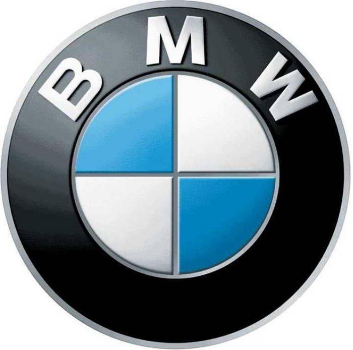
BMW`s logo has preserved its historical origin from when they still produced airplanes. The blue and white colors depict a spinning propeller. Fact: BMW produced airplane engines for Germany in World War II.
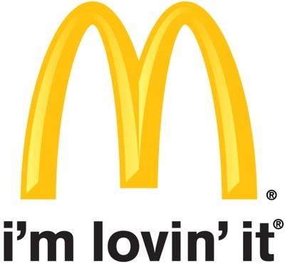
McDonald`s logo is one of the simplest yet most recognizable logos in the world. During the company`s operations, there was a desire to change it, but design consultant and psychologist Louis Cheskin convinced the management to leave the logo as it was. Two large arches symbolize breasts that feed people. His comparison has been successful, and the logo has only grown in popularity.
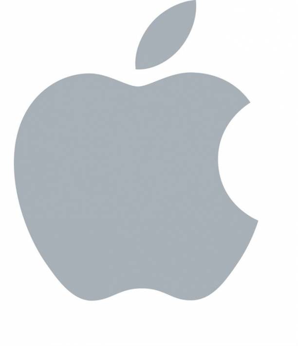
Apple`s logo is as simple as it looks; it symbolizes the forbidden fruit of paradise, the tree of knowledge. This is a more modern and simpler logo, but in the first version, you could see the tree itself and the apple.
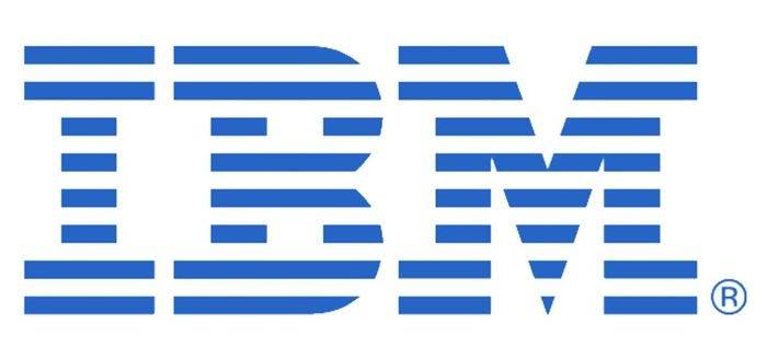
IBM`s logo contains a hidden message to the world; the white stripes that cross the letters and divide them into equal parts symbolize equality.
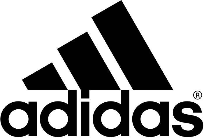
Adidas logo symbolizes a mountain. Back in 1967, when these three stripes were straight, they symbolized nothing; they were created simply to be a unique logo, but around 1990, the stripes were turned sideways to symbolize a mountain that people must overcome to achieve goals.
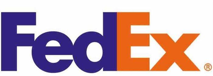
FedEx logo is creative and thoughtful. At first glance, you see nothing special, but the arrow formed between the letters E and X represents FedEx`s main idea: think ahead, look to the future.
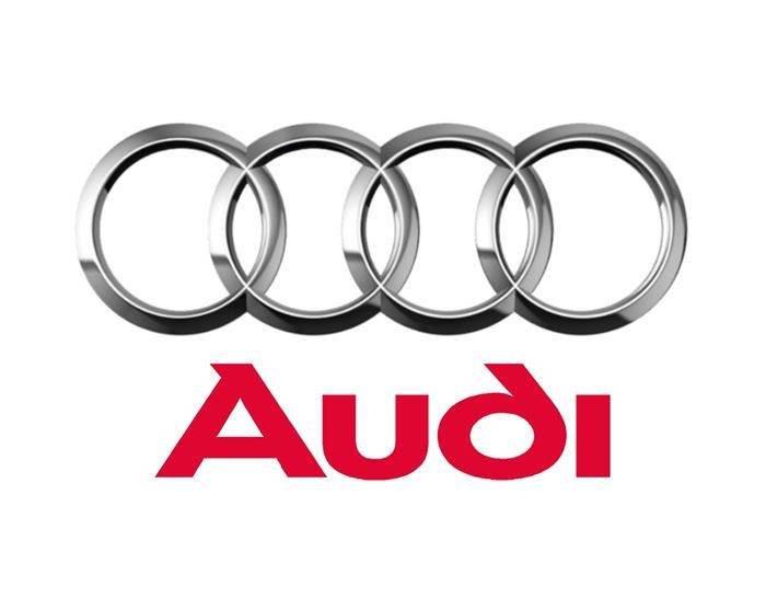
Four circles might symbolize car tires, but it`s not that simple. These four Audi circles represent the four companies that merged to form Audi (DKW, Horch, Wanderer, and Audi).
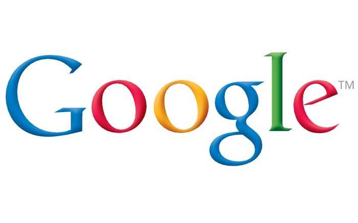
Google emphasizes its independence and desire to `not play by the rules.` The logo consists of simple and colorful letters without any special symbols. The color sequence is also deliberately mixed up.
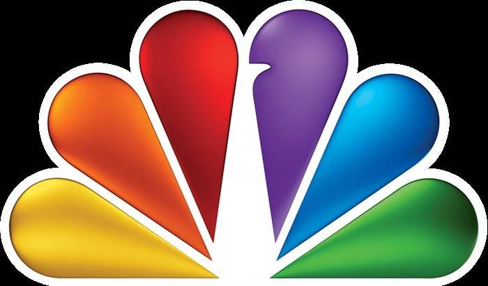
This logo depicts a peacock`s tail, but its many colors emerged when TV transitioned to color television. In the 1950s, as people switched to color TVs but continued watching black-and-white broadcasts, NBC added the colorful logo to symbolize the start of new technology.
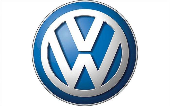
Volkswagen has kept its logo simple, just like its literal translation `people`s car.`
It`s all in the colors. Red represents power, while blue represents trust and security offered by this company.
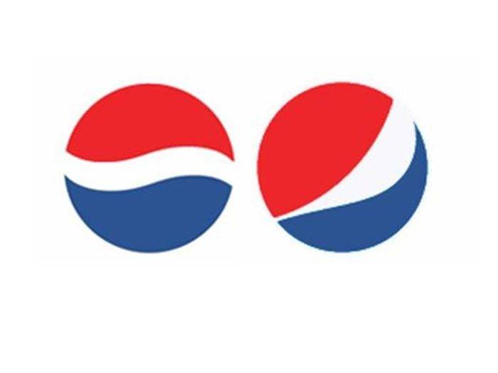
In 2008, Pepsi`s old logo (on the left) was replaced with a new one; this service cost them 1 million and several more millions to implement it in real circulation. The new logo`s motto: Pepsi logo is the key to the universe.
Liked what you saw? Recommend to friends
Next post